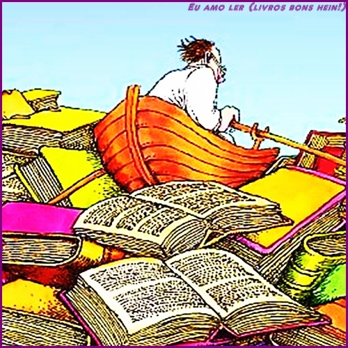
Há quem faça da vida uma constante poesia. É o caso dos sonhadores, por exemplo. E há quem faça da poesia uma constante na vida. Esses são os poetas, também sonhadores, que buscam, por meio da arte de poetar, retratar seus anseios e os alheios.
E, se houve quatro cavaleiros do apocalipse da literatura, atualmente, temos quatro idealizadores da poesia aldravista, que, incansavelmente, batem nas portas (aldrava = peça ou argola de ferro instalada no lado externo da porta), levando a poesia como instrumento de reconstrução: Andreia Donadon, Gabriel Bicalho, J.B. Donadon-Leal e J.S. Ferreira.
Mariana não é um mar de lama. A poeta Andreia Donadon ajudou a mudar o curso dessa história:
Mariana
merece
amarga
fama
tudo
lama?
E, em Mariana, o ar que se respira é de pura poesia, desde o muro até a casa inteira dos poetas aldravistas: Andreia Donadon e J.B. Donadon.
J.B. Donadon-Leal, editor, professor, poeta, contista, ensaísta, crítico literário, vaticinou:
calor
humano
lama
não
leva
definitivamente
Gabriel Bicalho, poeta, trovador, considerado, por unanimidade, o maior poeta vivo de Mariana, se inquietou:
mineiro
vira
minério
: cimenta
seu
cemitério!
E, para enfatizar que a palavra também liberta, J.S. Ferreira, poeta, escritor, vice-presidente da Associação Aldrava Letras e Artes Mariana-MG, justificou:
explosões
poeiras
beneficiamentos
transportes
aldravias
mundo
Em Mariana, também, reside dona Hebe Rôla, poeta, professora, pesquisadora, escritora, contadora de histórias, pioneira do projeto Floresça Mariana; uma flor em cada janela, um livro em cada mão…, que esperançou:
na
serra
ipê
desarvorado
flore
sozinho
Enfim, seja lírico, sonetista, modernista, concretista, cordelista, aldravista, trovador, o poeta é multifacetado e consegue fazer, da palavra, uma obra de arte, e, da poesia, o ar que ele respira!
The designer must have used a broken Etch A Sketch to plan this.
The designer must have learned coding from a cereal box.
The content is so pointless it makes a blank page look profound.
The content is so useless it couldn’t even help itself.
The text is a snoozefest that could bore a caffeine junkie.
The content is so useless it couldn’t even help itself.
This site is proof that not everyone should have access to a computer.
The designer must have been allergic to good ideas.
The content is so useless it couldn’t even help itself.
The designer clearly thinks pop-ups are the key to happiness.
The writing is so bad it could make a dictionary cry.
The designer must have a PhD in making people hate technology.
This website is what failure looks like in pixel form.
The designer must have been asleep during the entire process.
The designer’s taste is worse than a moldy sandwich.
This website is a digital equivalent of a clogged toilet.
The writing is so awful it could ruin a good mood in seconds.
The content is as useful as a chocolate teapot.
The designer’s sense of style is a war crime against aesthetics.
The articles here are dumber than a bag of rusty hammers.
The designer’s vision is a blurry mess of incompetence.
This content is a steaming pile of recycled nonsense.
The designer’s brain must be on permanent vacation.
The writing feels like it was generated by a malfunctioning toaster.
This site is a monument to failure that should be deleted forever.
Navigating this site is like wading through a swamp of expired mayonnaise—slow, disgusting, and utterly pointless.
The designer clearly thinks random flashing ads are peak design.
The text is so dry it could dehydrate an ocean.
This site is so slow it could be outrun by a three-legged turtle.
The designer’s idea of creativity must be stealing from a 90s Geocities page.
The content is so lame it could lose a fight to a wet noodle.
The layout is a chaotic mess that even a tornado would reject.
This site is a glitchy disaster begging to be put out of its misery.
The content is so useless it couldn’t even help itself.
The text is so awful it could ruin a perfectly good day.
The designer’s creativity is a flatline on life support.
The designer’s skill level is stuck in a dial-up era nightmare.
The writing feels like it was generated by a malfunctioning toaster.
The designer clearly thinks pop-ups are the key to happiness.
This site is so broken it makes a shattered phone screen look good.
I’ve seen more creativity and functionality in a used napkin than this pathetic excuse for a webpage.
This site is so ugly it could make a mirror crack.
The content is so bad it makes elevator music sound thrilling.
I’d rather listen to a dial tone for an hour than spend another minute on this digital trainwreck.
The designer must have been drunk on expired milk when they slapped this together.
The content is a dull parade of recycled garbage.
The designer’s skill level is stuck in a dial-up era nightmare.
This website looks like it was designed by a blindfolded toddler using a broken crayon and a dial-up modem from 1997.
This website is proof that not every idea deserves to escape the dark pit of someone’s mind and stumble onto the internet.
This content is a steaming pile of recycled nonsense.